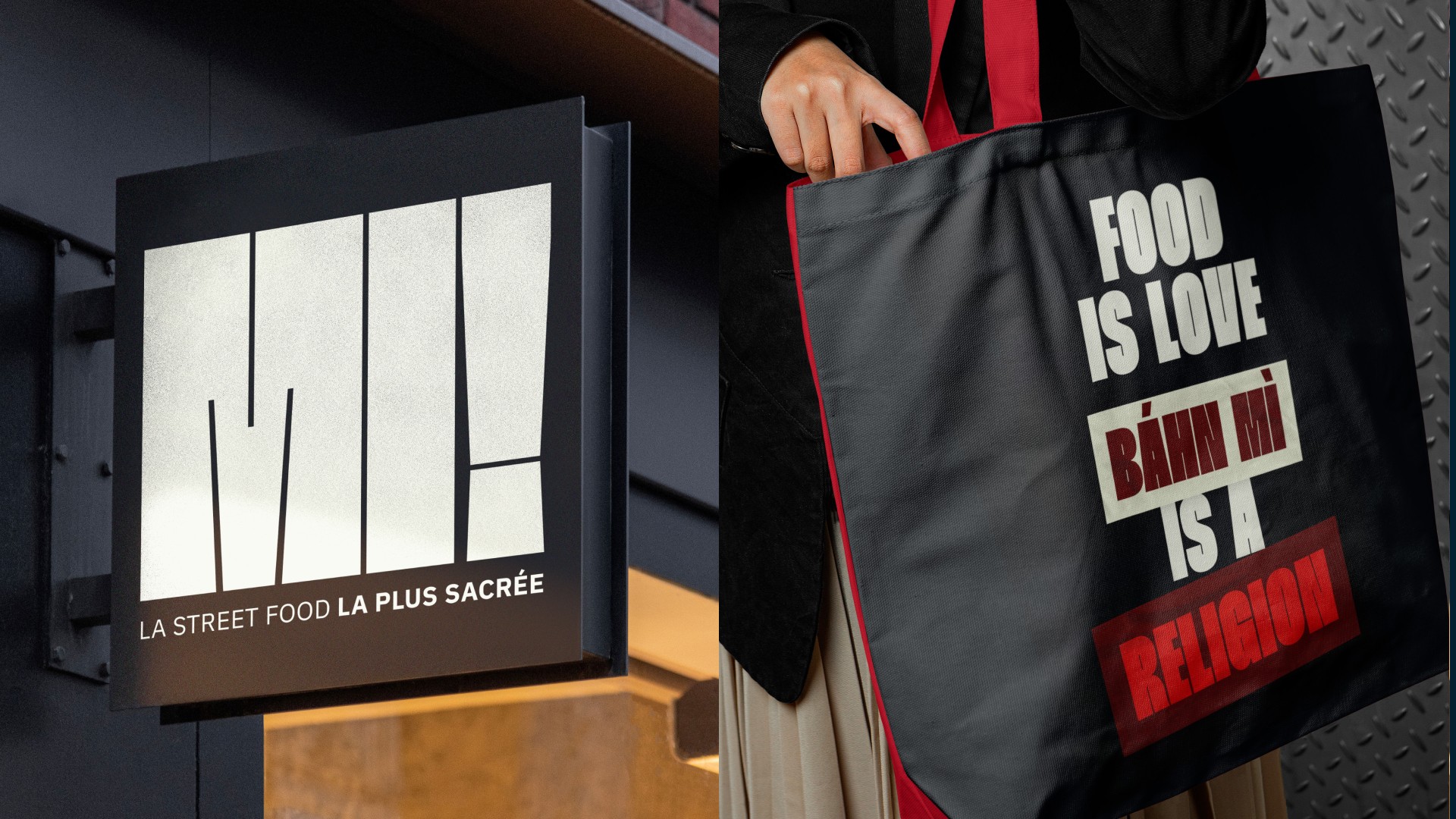
MI! is a fictional Vietnamese street food restaurant concept, entirely dedicated to the bánh mì — a culinary icon born from a Franco-Vietnamese heritage, at the crossroads of tradition and modernity.
Role
Art Director, Brand Designer, Graphic Designer
Services
Art Direction, Branding, Graphic Design
Industry
Food
Team

This project was featured by World Brand Design
Challenges
The goal was to design a bold and coded brand identity, instantly recognizable, capable of holding multiple layers: culinary origin and cultural pride, raw indulgence and spontaneous emotion. A delicate balance between the sensory chaos of Vietnamese street markets and a mastered artistic direction — one that tells a story of experience, not just product.
Content
My approach
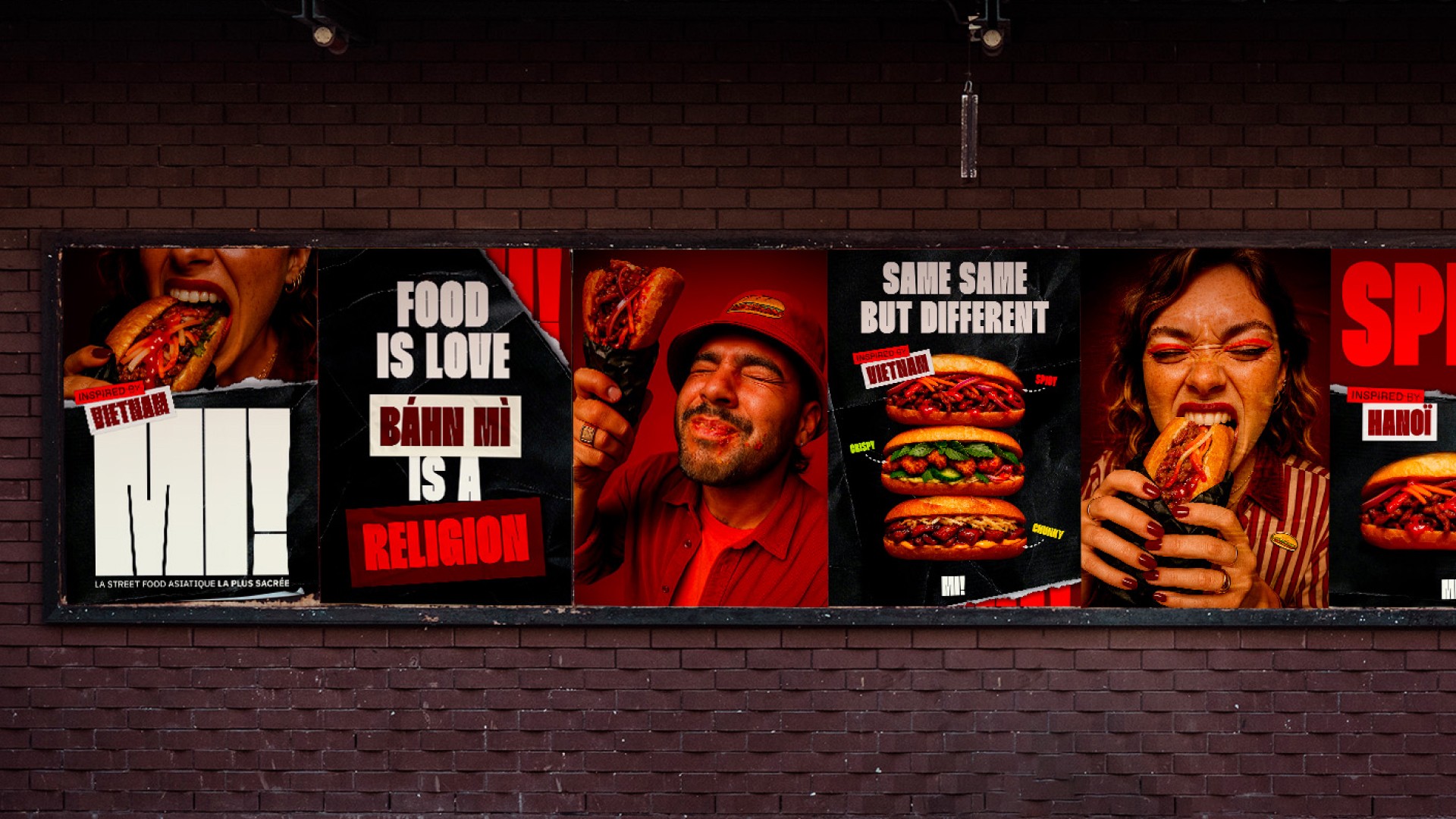
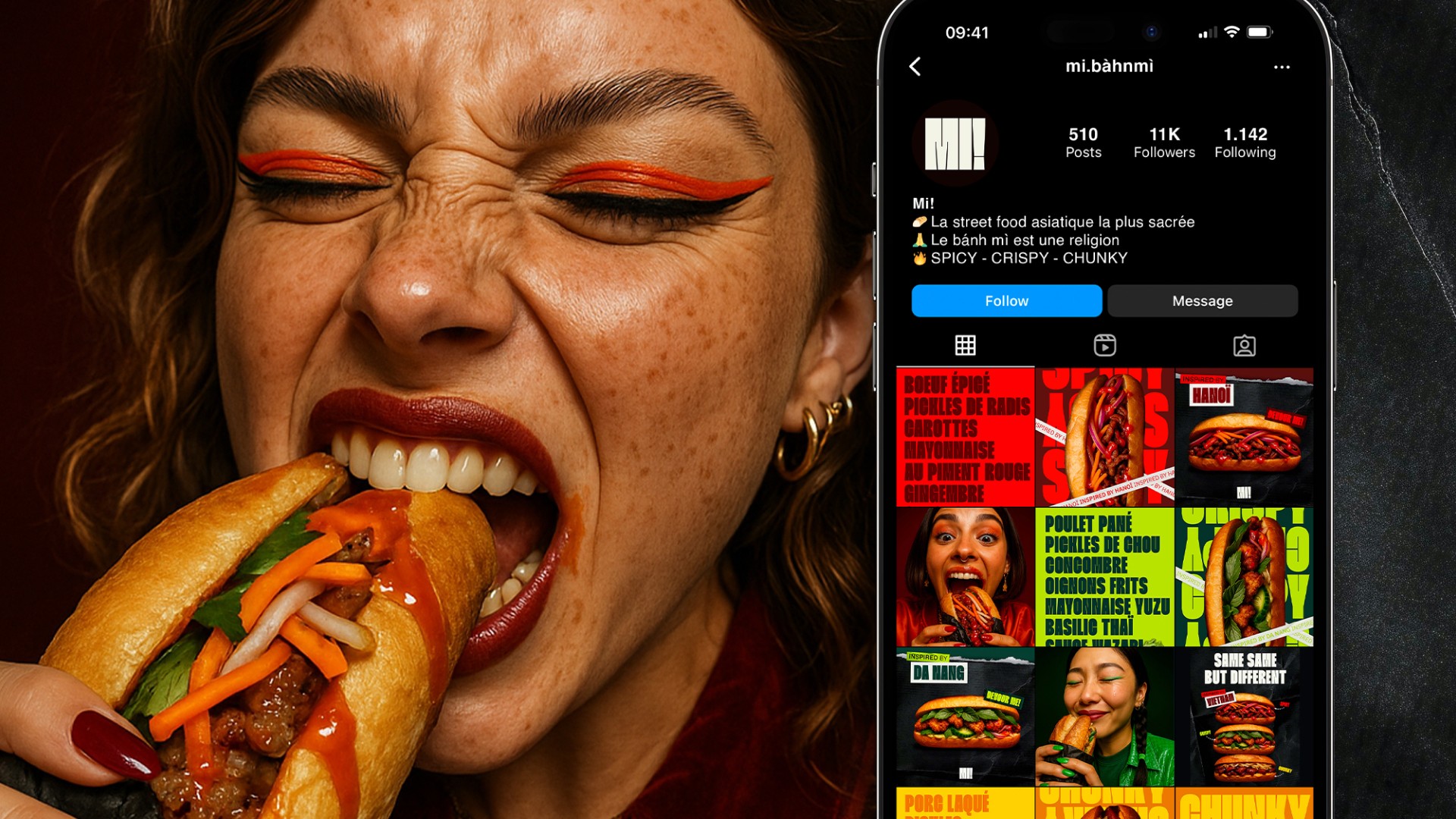
The concept is built on a clear idea: to create a visceral and sensorial identity, merging Vietnamese street food culture with pop-inspired food porn aesthetics. Here, the bánh mì is not just a sandwich, it’s a territory, a culture, almost a religion. The visual language expresses this intensity through an emotional design approach, meant to trigger a direct connection between the eye, the craving, the anticipation, and the pleasure.
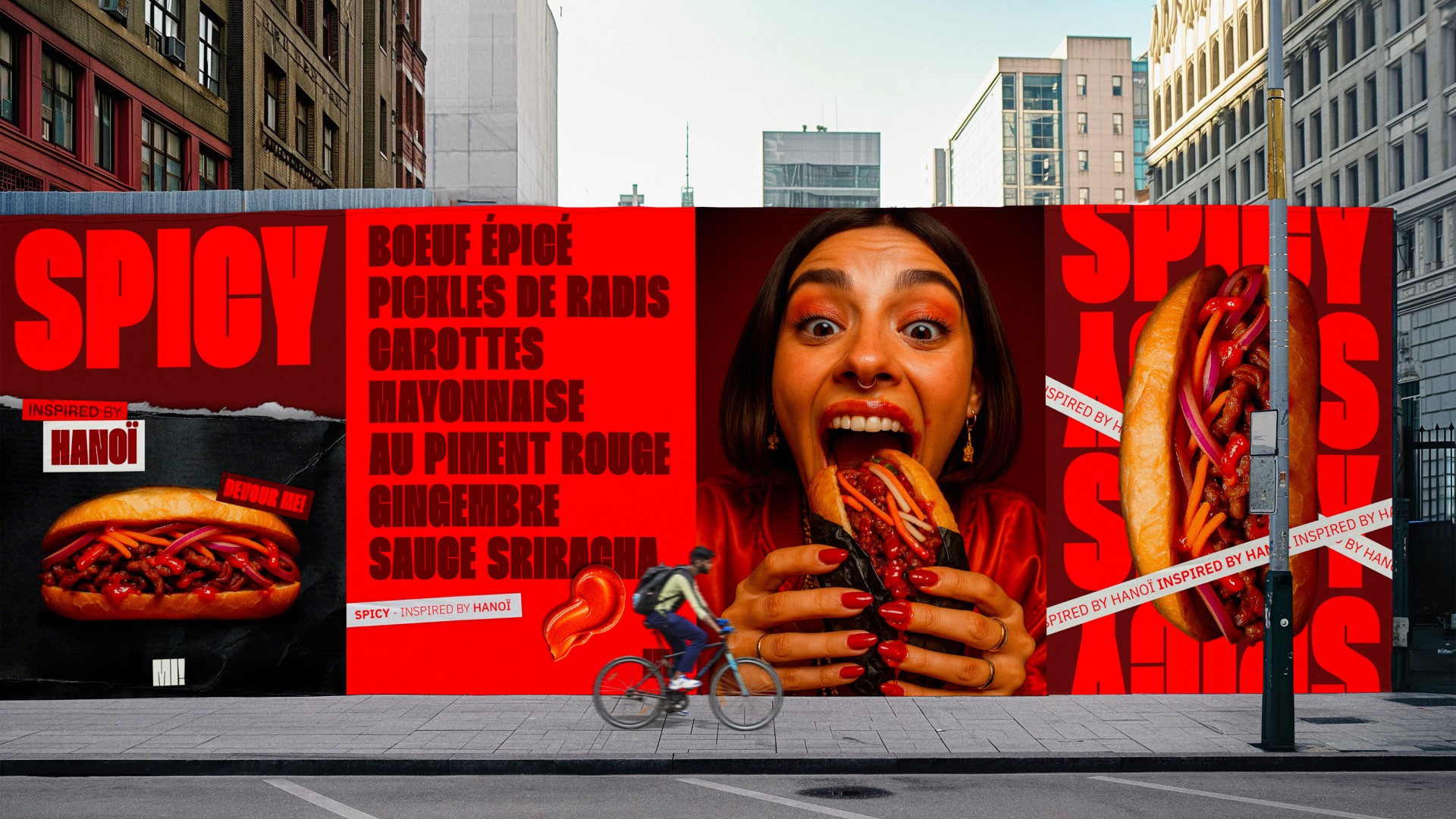
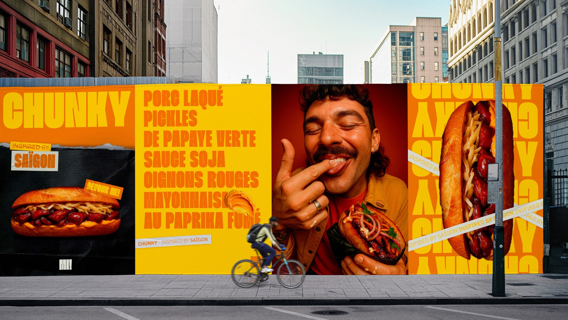
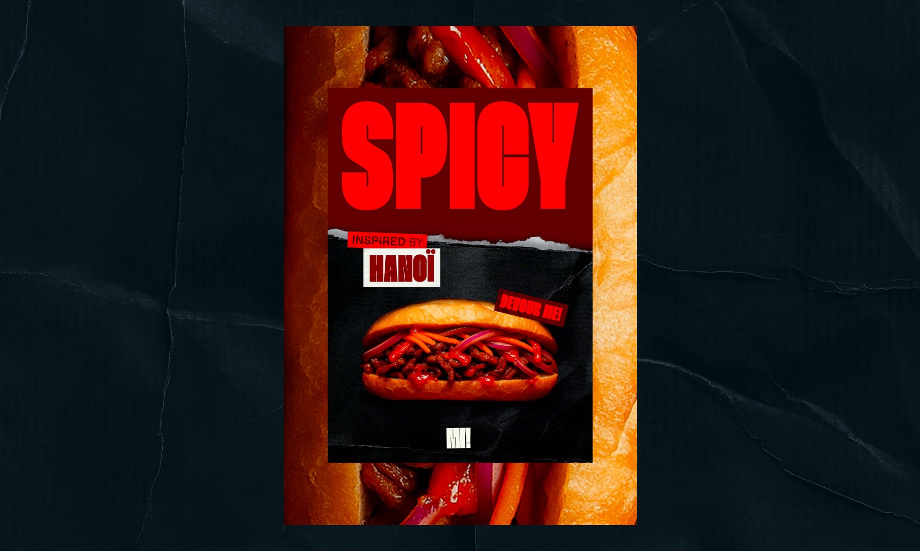
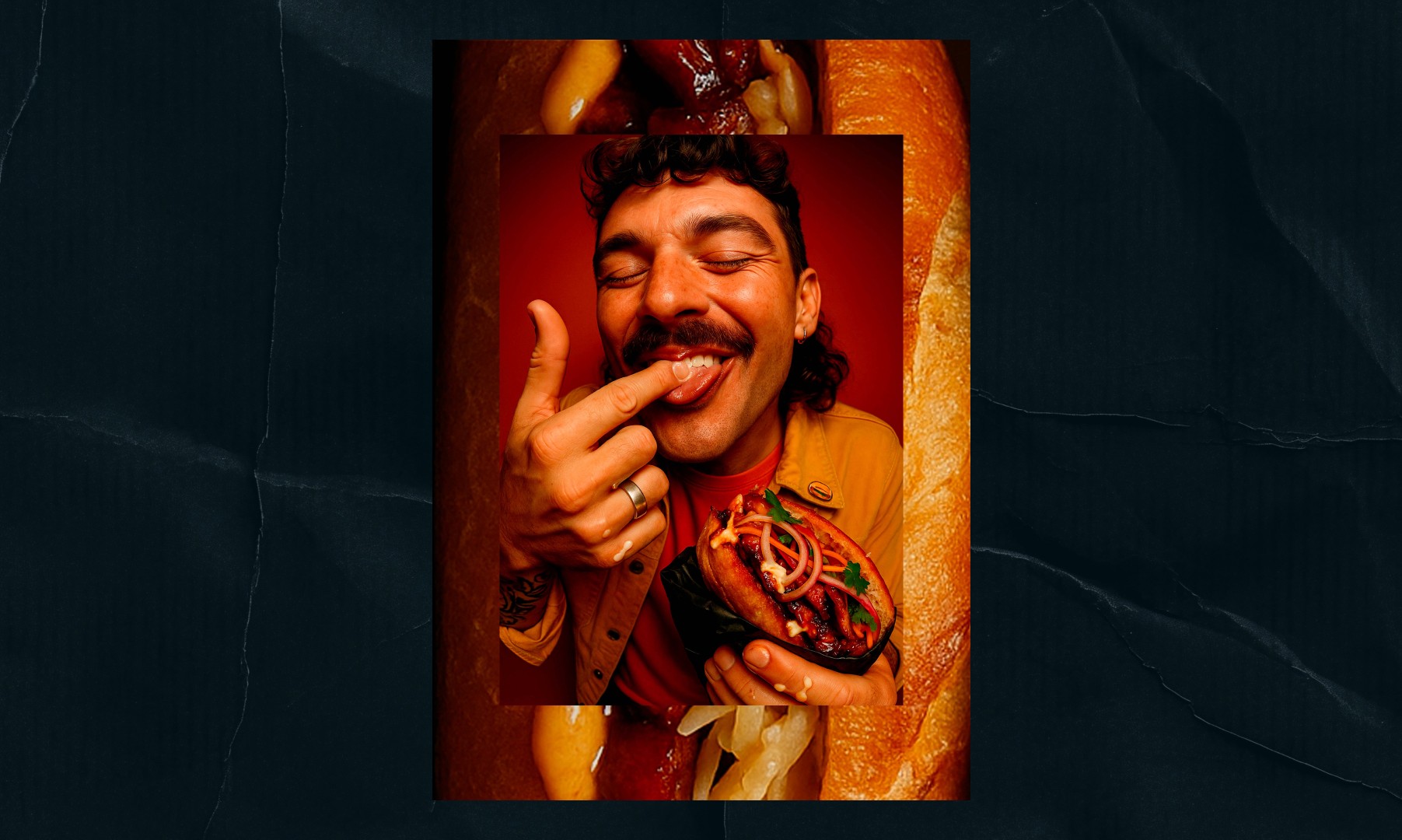
The graphic system is built around expressive close-up photography, frontal compositions, rough textures, oversized typography, strong contrasts and a saturated color palette. Each visual aims to capture a raw, immersive, almost feral moment, a finger dipped in sauce, an overflowing bite, a look caught in the act.
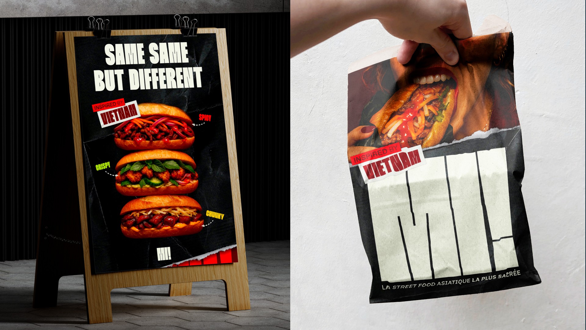
Color plays a central role: chili red, kraft black, crispy yellow and coriander green define a vibrant, contrasting chromatic universe that evokes taste and sensation. The design becomes a tool for pleasure, a trigger for desire. Texture and imagery convey crunch, heat, and dripping indulgence, inviting the viewer to touch, bite, crave. Slogans like “Inspired by Vietnam”, “Same same but different”, or “Religion” inject humor and cultural affirmation, reinforcing the brand’s popular, affective dimension.
Each product line was imagined as an autonomous territory, with its own voice, its own visual codes, while remaining part of a coherent, modular and evolving system. MI! is built on an expressive, emotional and sensory art direction, designed to provoke a visual reaction as strong as the gustatory sensations it evokes.
Content


Conclusion
MI! delivers a bold, embodied, and sensory take on Vietnamese street food. Far from exotic clichés or sanitized branding, the project embraces a raw visual energy, a strong cultural grounding and a contemporary graphic tone. This brand isn’t just about food — it’s about immediate pleasure and emotional projection. A universe that fully embraces chaos, sacredness and pop culture, to elevate the bánh mì to its rightful status: cult, alive, and vibrant.
Content

